Designing a Sub-1kb Homepage: A Challenge in Imagination and Purposeful Coding Approach
on Blog
I designed a homepage under 1kB recently. Although I reverted it after a few weeks, I decided to write a blog post on why I made it and the reason behind my decisions.
From its website: the 1kB Club is a list of web pages weighing less than 1 kilobyte (1,024 bytes). Similar to Code Golf, the challenge is to achieve the maximum outcome with the least amount of code.
I’m intrigued by challenges like this because they inspire individuals to be imaginative when tackling the task within set limitations, resulting in a refined and purposeful coding approach. Like the lean and uncluttered writing style of Hemmingway, but in code.
Anyway! This is what I came up with.
The design
<!DOCTYPE html><link rel="icon" href="data:,"><meta name="viewport" content="width=device-width,initial-scale=1">
<title>josephward.tech</title><pre> <style>html{max-width:70ch;padding:3em 1em;margin:auto;line-height:1.75;font-size:1em}
</style>
👋 <b>hello, i'm joseph ward</b>
✉️ <a href="mailto:joseph@josephward.tech">email</a>
🐦 <a href="https://shorturl.at/hMNSW">twitter</a>
🧑💻 <a href="https://shorturl.at/flvw7">linkedin</a>
┌─ 2017-now
│ └─ consultant software tester @ <a href="https://bjss.com">bjss</a>
│
├─ 2016-2017
│ └─ software tester @ <a href="https://sparkol.com">sparkol</a>
│
├─ 2013-2016
│ └─ software tester @ <a href="https://hl.co.uk">hargreaves lansdown</a>
│
└─ 2010-2013
└─ jnr software tester @ <a href="https://directline.com">direct line</a>
tech: js/ts/python/c#/java/whatever works
📝 <a href="https://shorturl.at/agoS3">blog posts</a>
🗣 <a href="https://shorturl.at/BIX05">meetup talks</a></pre>
You can see how this looks by clicking here.
Breaking things down
<link rel="icon" href="data:,">
link’s rel attribute icon imports an icon to represent the document. The href attribute of data: denotes a data URL, which is empty. This sets a blank favicon without a HTTP request (which browsers do by default).
<meta name="viewport" content="width=device-width,initial-scale=1">
The viewport meta tag instructs the browser on how to display the web page on devices with varying screen sizes and resolutions. The width=device-width, initial-scale=1 attribute sets the width of the viewport to the width of the device, which allows the website to scale to fit the screen. The initial-scale=1 attribute sets the default zoom level for the page when it is first loaded, ensuring that the website appears at its actual size. This attribute is important because users can change their browser’s default zoom level, and different devices have varying pixel densities, which can affect how the website is displayed.
It’s amazing how much of a difference that viewport meta tag makes for mobile browsing. Props to people who make websites work on tiny screens!
<style>html{max-width:70ch;padding:3em 1em;margin:auto;line-height:1.75;font-size:1em}</style>
This looks complicated!
max-width:70ch sets the maximum width of the document to 70 characters (“ch” = “character width”). It ensures the <pre></pre> content won’t not exceed a certain width and will be more readable on different screen sizes.
padding:3em 1em sets the padding of the document to 3 times the size of the current font on the top and bottom, and 1 time the size of the font on the left and right. This adds some space between the content and the edges of the screen. Means the <pre></pre> content will be nicely vertially centred.
margin:auto centers the document horizontally within the viewport.
line-height:1.75 sets the line height to 1.75 times the font size. It creates some nice spacing pretween the lines in the <pre></pre> content.
font-size:1em sets the default font size. 1em is default, which (like setting initial-scale=1) may seem a bit redundant, but it accounts for custom settings and differences between browsers.
<pre></pre> formats website content ‘preformatted text’ tags. These ensure that the content within them is displayed in a fixed-width font and with all the original formatting preserved. This enabled the use of ASCII text to create a table displaying work experience without needing to concern oneself with HTML formatting.
a tags weren’t used in a special way, the only extra thing I did was shorten the URL they were pointing to with https://shorturl.at to conserve space.
Other pages
My website is not only a CV, but I also use it to share my blog posts (such as the one you are currently reading) and information about the talks I give at meetups. If I stop using a static site generator, I won’t be able to show those pages.
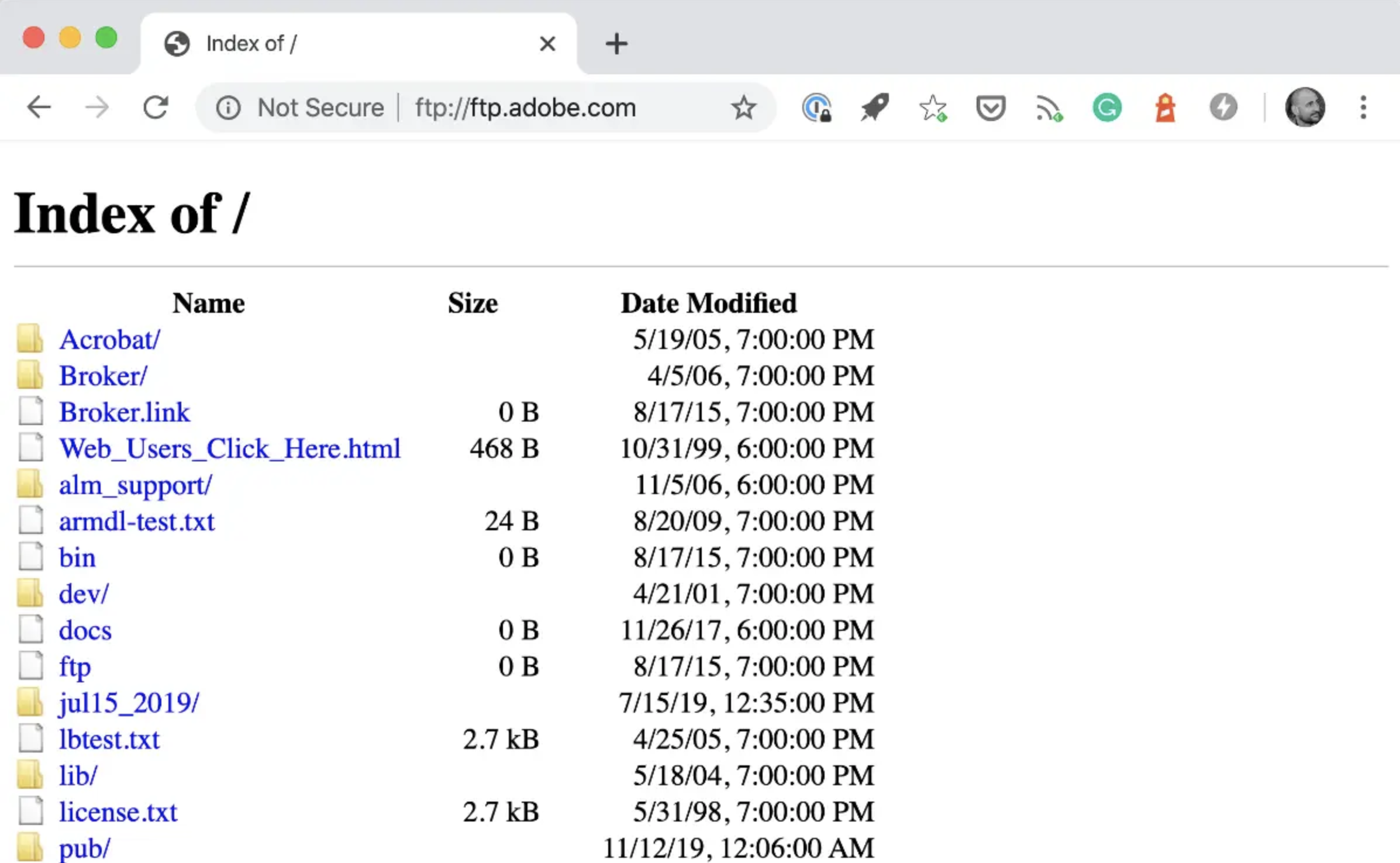
At first, I tried to replicate a simple, ftp-style browsing experience with some open source libraries (like below).
This turned out to be a lot of hassle. Effectively, I was spending a lot of energy and adding a lot of “page weight” to emulate simplicity that wasn’t there. Unideal!
Then I tried converting the way I write my blog posts, from markdown to basic HTML. But to be honest, I wasn’t sure how sustainable that approach was going to be.
The solution I finally settled on is shown in the HTML above. GitHub’s web interface displays a basic file directory, and the viewer previews markdown files. It’s a good imitation of the original experience.
Why I backed out the change
You can see that I am no longer using a basic, lightweight website. It was a useful experiment, but:
- I wasn’t satisfied with how my blog posts were presented. My goal is to make it easy for people to read and engage with my content. Switching domains and searching for a post required too many extra steps. Also, GitHub’s markdown file preview doesn’t show the blog post’s text, which a specialized static site blog generator like Hydejack does.
- The idea was very niche. I enjoyed the challenge of making a website that was only 1 kilobyte in size, which is what the 1kb club is all about. However, to appreciate it, you have to explain what the 1kb club is. Some people might think the simple design is lazy or unprofessional, which is not what I wanted.
- I couldn’t track page visits anymore. My landing page was too big to include a Google Analytics tracking link without going over 1kb, and using GitHub for my blog means I can’t track clicks either. Even though not many people visit my blog, I would still like to track page views.
- Limited options for social sharing using GitHub. I don’t really have a platform. Sharing blogs on social media (including testing Slack groups) is about all I do. GitHub links don’t have great social meta tags and my homepage had none! This made is very annoying to share.
- Eventually, I got bored. Simply put, I ran out of ideas for trimming characters making my homepage even simpler after a few weeks. It’s funny because I can think of a few more ideas now!
Conclusion
Overall, this was an enjoyable challenge, and nice to have online for a few weeks. Since I spent several hours of my free time working on it here and there, I didn’t want to undo all my work without reflecting on it first. The challenge taught me new ways to reduce page weight and size. Writing this post was also interesting for me. I haven’t published much lately because I didn’t think my day-to-day work was worth writing about or that my spin on testing philosophy was all that unique. However, I decided to write about this challenge, because writing something is the best way to get back into writing anything.